


Colors actually make a deep impact on us. For this reason, a lot of care should be given to picking out the right ones for your home. Many people look at colors only to incorporate a theme, but colors can make a deeper impression on our psyche. What is interesting to note here is that almost every color in the color wheel can create a positive and a negative response; its how you use that color that will make a difference.

Being mindful regarding this aspect can go a long way in ensuring that your home is a relaxing haven where you can hide after a stressful day. Colors tend to impact us largely in an emotional manner. It should also be noted that the depth and hue of the color can also be responsible, not only for producing an emotional response but for also adding space, diminishing it or more.
For this reason, we’re going to break down the colors and define their positive and negative impacts and how you should be using them in your home:
Red
An exciting color, red instantly raises the energy levels of a person and amplifies the emotions they are feeling. It can make a person feel passionate, angry, excited and even get their adrenaline flowing. Caution is needed in using it because it makes one feel energized. When used at home, it can be used to great effect in the living room or the dining room as it helps to draw people together, stimulate a healthy appetite as well as conversation.

Be careful in picking out the right shade though because crimson or other shades of red can actually make one feel more rage or aggression. When used in your bedroom, it can be great for creating passion, but it can also raise blood pressure and increase the heart rate. Red is often not used for bedrooms as it is considered to be too stimulating. However, if used in a deep muted tone, it can create an aura of exclusivity.
Pink
While it would usually be classified under different tones of red, pink stands out as being one of the most popular colors from tones that are created from a primary color. The universal recognition of the color makes it popularly used all across the globe and based on the kind of hue that is used, it can induce different responses. Electric pink or deep pink shades give a feeling of excitement while paler hues of pink can have a calming effect.

Due to the fact that it is so deeply associated with femininity, it is widely used by girls and women. The color also expresses a romantic and playful aura, which is why it is popularly used in bedrooms. It is interesting to note that while pink is used largely by women and girls, it was once considered a masculine color and in France, is still popularly used by men.
Yellow
Vibrant, bright and optimistic, yellow is a cheerful color that is loved because of its airy quality. It can make any area appear open and welcoming and uplift the mood of a person. As a happy color, it is popularly used in areas of the house that can maximize the benefits of yellow. For example: Using yellow in a small room can make it look more spacious. Using yellow in the kitchen can also have a positive impact on the appetite as well as the mood of a person.

Care has to be taken in using yellow because too much yellow can have a negative emotional response. When used in large spaces or when deeper hues are used, the color has been known to cause feelings of frustration, irritability and unnecessary anger. Babies also tend to react negatively to yellow and are prone to cry a lot more in yellow rooms. When using yellow, use it for accents and stick to lighter and brighter variants that can give a room warmth and cheerfulness.
Blue
Recognized for being the most calming color, blue is loved in all hues and shades to use in the room. A very cool toned color, blue can be used to induce a feeling of serenity and relaxation and also aids sleep. It can also bring down respiration rate and blood pressure and is great for creativity as well as mental stimulation. This makes it popular for use in various home studios, classrooms, and more. The calming properties of blue also make it a popular choice in bedrooms. When paired with neutral warm tones, the color can create an environment that encourages trust and tranquility.

Caution has to be exercised with the use of blue since it does have negative effects too. Since it is a cool color, in areas colder climates, the color can make a room positively chilly. Similarly, it can also induce depression, particularly in people who are prone to SAD – seasonal affective depression. This effect is multiplied if the room or area where the color blue is applied doesn’t get a lot of sunlight. Balancing with warm accents and more is necessary. Also, avoid using blue predominantly in the dining room as it can negatively impact the appetite as it is known to suppress it.
Green
Considered to be a restful color, green has a lot of versatility because of its positive impacts. It is one of the few colors that have a negative impact and it can be used in various rooms. It is associated with fertility, luck, wealth and fruitfulness. The color not only helps to relax but it offers the best qualities of blue and yellow. The shade of green you use can vary based on the kind of room you are considering it for. If you want to use green in your kitchen, choose variants that have more yellow in them. Lime-green and different shades of yellow green can make the room feel cheerful and relaxing.

For bedrooms, make use of greens that have more blues in them but opt for pastel shades. These give you the optimum benefits of blue, making the room soothing, relaxing and calming at the same time. Deeper shades of blue green variants are perfect for living rooms and other socializing rooms. This is because these colors can help a person to unwind, alleviate anxiety and encourages people to interact and connect. Aqua shades of blue-green also help to give you a relaxing, spa type aura that will make any room extremely relaxing.
Orange
A cheerful, enthusiastic color, orange is very uplifting. It has the cheerfulness of yellow and the same energizing qualities of red without any of the negative effects. One of the reasons why it is popularly used is because it works well with other colors. Paired with earthy tones, it has a grounded quality that is still uplifting and encourages deeper connections. It is usually used in these combinations in the living room or different social areas because it creates a visual comfort and makes one cozy with ease.

Caution has to be exercised with the use of orange since it is such an energizing color. It is largely never used in bedrooms and even then, in small, controlled amounts. If you have a home gym or like to work out in a particular area, use orange in those areas as it energizes one and definitely boost motivation and stamina and alertness of the mind. It is also a color widely used by athletic brands for this very purpose.
Purple
Purple is connected with luxury, opulence, mysteriousness and calmness. Purple has the benefit of bring the calmness of blue without the coolness as red effectively adds warmth to it, even in its darkest shades. Different shades of purple can incite different responses in a person. In deep, dark shades, such as eggplant purple, it can be considered to be reflective of mysteriousness, luxury, sophistication and richness. Deep purple is largely used for accents or as a complementary color.

Lighter shades of purple such as mulberry, lilac and lavender are perfect for giving a room a warm, calming effect. It can also be used to complement a current color scheme and give it more depth. The versatility of the color also makes it very popular. The deeper colors of purple are usually used in living rooms or social rooms where you will be entertaining guests and more. Lighter shades of purple are better suited for use in bedrooms as they can be more helpful in calming one down and inducing sleep.
Black
While black is a color that adds mystery and depth, it is always best to use it in small amounts. Too much black can not only make a space look more cramped, it can also cause feelings of distrust. When used for accents, black can give a feeling of richness and elegance but careful application is necessary. While white is the main color that is used to cut down black, other neutral colors such as gray, brown and white are also great to create a cohesive theme that doesn’t drag one down. Too much black can create a feeling of emptiness and create negativity.
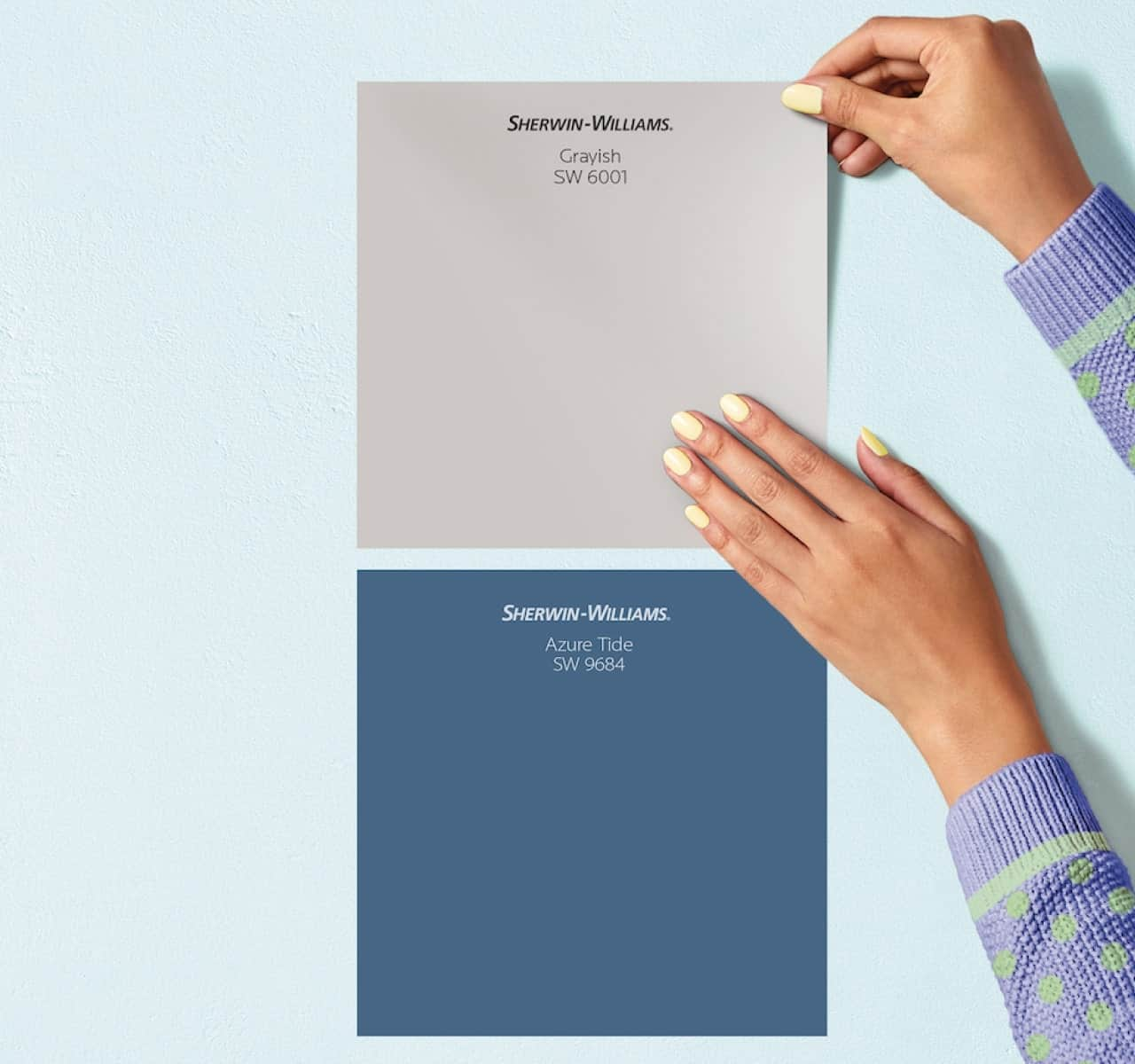
Gray
An extremely versatile color, gray introduces sophistication and can be used with almost any color scheme. In many cases, it adds a light touch of muted confidence and at times, elevating the other color, highlighting the positive impact of the color. Used with warm colors, it can add a cooling tone without muting the beauty of the warm color. Gray can be used without other colors too but in darker shades, it can be rather stern and induces formality. For this reason, it is popular to use it in offices. Just be mindful in using it because too much gray can cause feelings of depression.
White
White is a popular color of choice because the color represents youthfulness, cleanliness, neatness and appeals to fastidious people. White can also be cooling but while it can be used on its own, it has a tendency to make a room feel empty. Yet the fact that white is a color that can be used with any color enhances its usability and makes it extremely popular for use. Many people choose to use white primarily and add accents in different colors. This practice not only prevents white from becoming too monotonous, it also ensures that the color being used is main focal point.

Brown
A deep, rich and earthy color, brown has a feeling of warmth, richness and coziness. As a color that stabilizes a person, brown has a grounding quality that makes it perfect for use with different colors. Different shades of brown such as mocha, coffee and more can be layered and complimented together. Using the color brown can also help to ground the different qualities of colors. Deep chocolate brown can help to ground the energizing quality of orange or to maximize the calming qualities of mint green or lime green colors. While it can be used with blues and reds, a bit of careful matching is necessary to ensure that the colors do not clash with each other.
Work With One Man and a Brush – Pro Painters
If you’re considering making use of professional painting services for your home, get in touch with One Man and A Brush Pro Painters. Our services are perfectly crafted to meet all your painting needs. With our eye for architectural design and understanding of interiors, we can give your home the perfect makeover that you have been hoping for.
For more information about our services, make an appointment or to get a quote on a certain project, please get in touch with by calling or texting: 678-368-5115. With a BBB accreditation and a stellar reputation, we are the best professionals to handle any painting job you might have in mind. Whether you need the interior painted or exterior painted or have some other DIY project in mind, we can provide you with the best results to give you your dream home.