


The prospect of painting the interior of your home can be a daunting one. Where does one start? What colors would look best in the different rooms? No wonder that it can seem like such a stress-laden job. But there’s another side to interior painting that you should tap into, and that’s sheer excitement and joy. There aren’t a lot of home improvement activities that bring a household together like painting the walls. Even if you’re not doing the actual painting yourself, it’s hard to hold back the rush of giddy anticipation as you watch the colors slowly and beautifully come together.
In the stress over the technicalities involved, it’s important to not lose sight of all the joy a well done paint job can bring you. And as for said technicalities, we have you covered here. Here’s a comprehensive look at some of the basics you’ll need to keep in mind when getting your house painted.
How to Select the Right Paint and Colors
Paints and Sheens

While most people put in a lot of trouble to consider their color options, they generally don’t put in a similar effort in another equally important choice: the kind of paint to use. There are many different kinds of paints, and they differ in terms of their sheens as well as whether they are oil based or latex based. What base you choose very much depends on the type of surface you’ll be applying it on. Oil based paint is often used to prime wood moldings and trim, since it will seal any knots and stains from the wood. On the other hand, latex based paint is a lot more versatile — thanks to the ease with which it can be cleaned up as well as its longer durability. This is why it is more commonly used in most household uses and to paint walls. Latex paint is also a lot more resistant to fading, and it doesn’t easily blister away. If you want the best of both worlds with your trim, try using an oil based paint as a primer, and then using a latex paint as the top coat.
When it comes to sheen, you’ll also have to factor in your surrounding environment before making a decision. Glossier paint is easier to clean, and so might be the right choice for homeowners with little children, or for a playroom. It’s also welcome in kitchens, since the walls here tend to get greasy, and will need to be regularly cleaned with a wet sponge. And it’s great for giving trim a finished look. Living rooms and bedrooms, however, would benefit from less glossy paint, since gloss will make more obvious any imperfections or blotches in the wall. The shine can also be less than pleasant in these rooms, since they’ll have sunlight pouring in.
Kitchens and baths could benefit from the less expensive semi-gloss, since they combine less shine with easy washability. Or you could use satin sheens for hallways and kitchens, since they’re easy to clean too, but don’t shine so lustrously. Eggshell is a popular paint to use on walls in the bedroom or living room. Matte paints hide flaws in the wall quite well, but it also shows dirt more clearly, and can develop patches after one too many cleanings. Eggshell, however, hides such flaws in much the same way as mattes, but are also easier to wash, more durable, and smoother to touch as well.
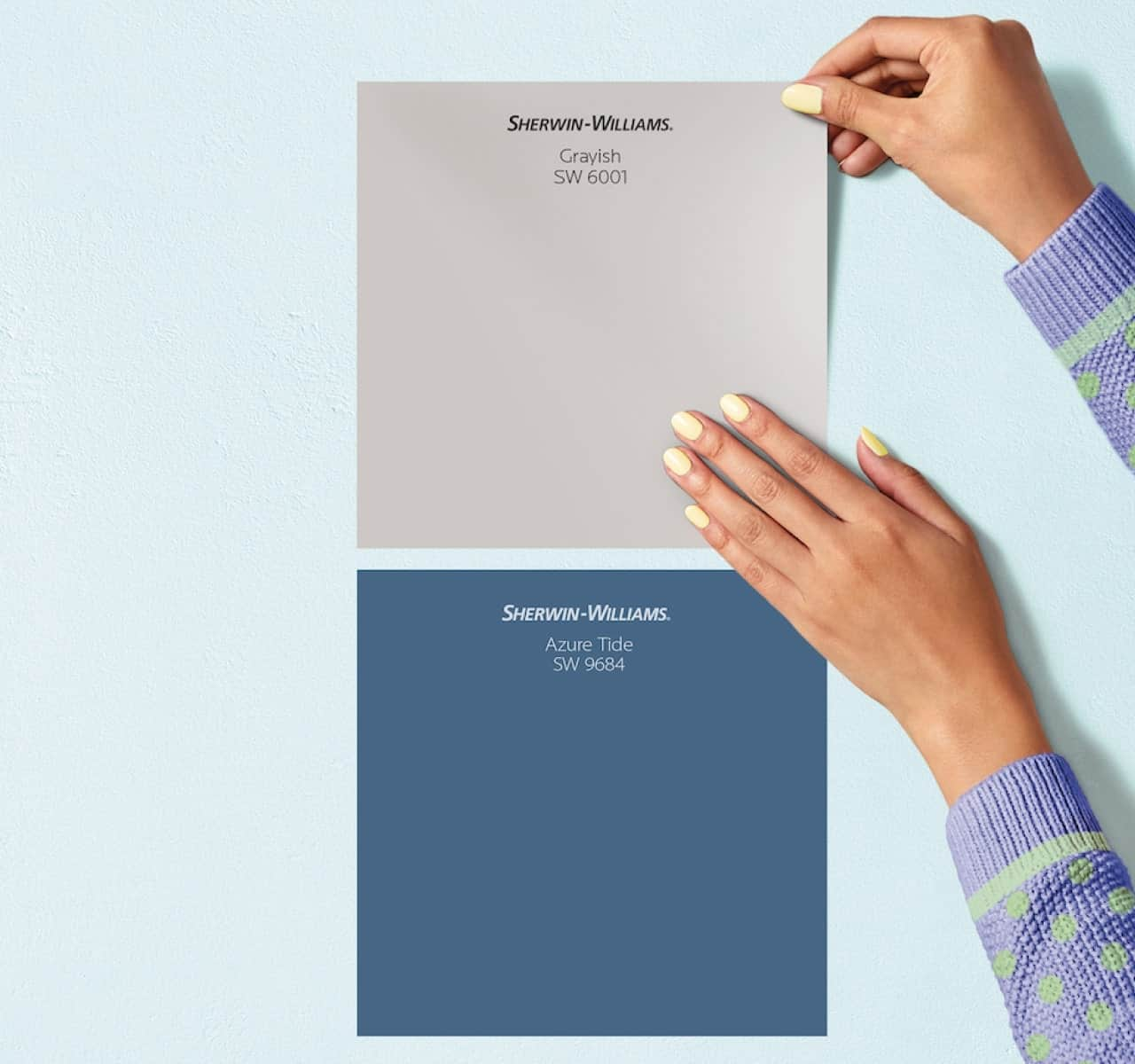
What About Color?

If you’re planning on selling your house, your best bet will be a neutral color like cream, beige or off-white. The tenants will then be able to paint over this with their own preferred choice of color, and so this would be a good card in your deck when you’re showing the house to them. Plus, such colors make the house look a lot cleaner and brighter as well, and give an illusion of open space.
On the other hand, if you’re planning on living in the house, it’s important to first figure out what kind of look you’re going for in each room. If you want your room to look tranquil and peaceful, you’ll want to go for cool colors like blue and green. If you want a more inviting and welcoming look, go for warmer shades like oranges or yellows. Let’s go into this in more depth by talking about the color wheel.

Following the color wheel can be quite useful as a reference for modifying more than one color. The primary colors on the wheel are yellow, blue and red. A combination of these colors leads to secondary colors: orange, purple and green. When colors on the wheel are opposite to each other, they’re complementary, meaning that their usage together provides a pretty contrast. Such complementary colors look a lot more intense when used directly next to each other.Colors near each other on the wheel are analogous, and their usage together makes the more dominant color stand out. Or you could use shades within the same color for a more consistent look. It’s amazing how many combinations work beautifully together. The use of a color wheel really opens a world of exciting new palette opportunities.
Plus, the color wheel is a great way to figure out the “temperature” of a color. A line drawn from the yellow-green point to the red-violet point will exhibit that the colors on the left side of the line are warm, and the ones on the right are cool.
If you want a tranquil look:

Stay monochromatic. Use different shades within the same color (preferably blue or green) in order to create a more soothing and calm effect. This will be especially true for cooler colors, but the approach can be used with dark colors as well. Use a dark color on the wall, and then a different or lighter shade of the same color for the trim. You could also layer your shades by using a lighter color as the base, and then a darker overlay. For a feeling of restfulness and tranquility, use light or pastel shades like lavenders, blues and pinks.
If you want a chic or sophisticated look:

Go with neutral colors. Given that most people think of neutral color as just white, cream or beige, you might find yourself surprised at the incredible range of neutrals out there. Give your room an elegant look by using shades like almond on the walls with brown on the trim. Or you could use shades of mahogany and rust for a richly elegant look, as well as an earthy feel. Lighter neutrals add to the sense of a neutral space, while darker neutrals add instant elan and panache. Neutral colors add to a room’s flexibility too, since all you have to do to drastically alter a neutral room’s look is to change the color of its accessories, or of the trim.
If you want a vibrant and energetic look:

Simply use vibrant colors, of course! Oranges and reds are apt here, especially when paired with their analogous golds and purples respectively.
If you need an accent color:

Depending on your main color group, use a complementary warmer or cooler color. You can create a more peaceful ambience by using darker or duller colors. If you were using a monochromatic color group, try a white tint to make for a visually striking accent.
It’s important to think about your mood when selecting a color for a room. So before you pick an option, ask yourself what mood you want the room to express. Do you want your bedroom to feel intimate and dramatic (for which you would require warmer or stronger colors), or tranquil and restful (cool, pastel or neutral colors)? Do you want your child’s playroom to be high-energy and exciting, or would you prefer it to have a less stimulating effect on your child? After all, colors do play a part in your child’s mood as well, and brighter hues might cause irritability. What about your dining room? Do you want it to be welcoming and bright, or quietly formal? If the former, you’ll want brighter and warmer colors, preferably contrasting ones. If the latter, you’ll get the ambience you want through neutrals and deep greens or blues.
Other Tips for Choosing Paint Colors
Even with all the tips we just laid out for you, choosing the right paint color can still seem like an overwhelming task. For one thing, just look at all the options out there! Luckily, there are some tips you can follow in order to narrow down the selection. Let’s have a look at these.
Lighting Matters

Most paint stores utilize light boxes in order for you to see paint chips as they will appear in that sort of lighting. No matter what shade you use, its effect will be altered by the kind of lighting there is in that room. If a room has natural daylight pouring in, you’ll be able to see the color in its truest form. If it has incandescent lighting, the paint will appear warmer and yellower, while fluorescent lighting will cause a sharp blue effect. Lighting, therefore, has to be accounted for when selecting a color. It wouldn’t do if you wanted a warm color for the kitchen, but its effect was undercut by fluorescent lighting. Similarly, a bright color might come across as too strong or overpowering if used in a room with plenty of natural sunlight, but this effect could be tempered if the light that fell on it was indirect or from an incandescent source.
Experiment with a Small Space

To ward off the daunt you may feel when trying to decide where to begin with a particular color, try experimenting in a smaller space first, like in a bathroom or a powder room or the area between two rooms, or a small hall. If you’re subcontracting your work, make sure to let the painters know that they’re supposed to inform you once the results are in. If you’re the one doing it, pick an area that’s small and easy to paint so the results are visible quicker. Refer back to the introductory paragraph on this one: painting is exciting and fun! If one color doesn’t cut it, don’t get discouraged and just move on to another one. You can get started by picking a color from one of the accessories or furnishings in the room as an accent or main color.
Test Your Choice of Color

Test the color on a poster board, or on large sections of the wall. (Don’t worry, you can just paint the wall over if you don’t like a color!) This is a great time to experiment with colors that are beyond your own personal comfort zone. Try out vivid and strong colors like red tinged with gold, or deep neutrals like dark chocolate brown as accent or main colors. This is also the time to consider painting the ceiling a stronger color to add an element of drama to the room.
Observe the Color in One Room from Another
The colors you use in the house should play out like elements in a grand theme, or a composition. Try viewing the wall in one room from another one to see how the different colors interact with each other. When you’re selecting colors, you should consider how they’ll look as part of a grander scheme, and incorporate the flow of color from one room to another in your plan. This way, you might decide to go for a complete contrast from one room to another, or for a smoother melding of different shades of the same color into a cohesive whole.
Use Decorative Finishes for Depth

A dull or flat wall can be transformed into an exciting personal space through the use of decorative finishes to dramatize the ordinary. You could try using burnished metal or mineral finishes to add some depth to the wall, or colored glazes. Alternatively, add texture to the walls by means of embossing.
Ultimately, the right paint color is really down to personal taste tempered by an understanding of complementary and analogous colors. Happy painting!